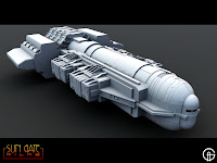
 It looks like the top ship here has been rejected, so I've submitted another design, see pic below, and they're happier with that one. Emmett says the top ship looks a little too ominous for what they want and they think the bottom transport ship looks more manned than the top ship. I suppose it because my top ship doesn't have windows and could be automated. Anyway I'm going to try and finish the top ship for myself one day and plod on with the 2nd ship.

6 comments:
I think they picked it for the rounder more modern look.
Both are great.
Loved the top one...what a bummer. The lower ship looks great too, but I really want to fly the top one.
I also like the top spaceship best,but I also think the bottom one is very nice also. Are these for a film or TV show ?
The thing about the top one is I could take the front nose off and those side cylinders and I could stand it upright and I could make some sort of building from it no problem. But I think I'll finish it as the ship !!!
I like both designs, the first one because of the ominous look they've mentioned and the second ship of it's very functional style.
nice. i like your ship designs .
it would be cool if eventually you were to compose all of your ships into one epic space battle.
Post a Comment